Systat Software Tech Bulletin | ||
|
March 2014 |
|
|
|
In this edition: | |
|
Systat Software Online-Seminar
|
|
|
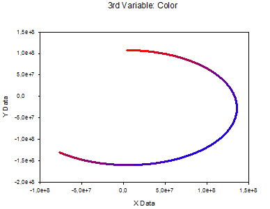
Colorline Graph In this XY line graph, the line color represents the grouped values of a third variable: col(3). Its values are grouped into a histogram, with the histogram limits/"buckets" in col(4), and the associated colors in col(5).
With SigmaPlot's Statistical Transforms, you can center and normalize your data. [PDF]
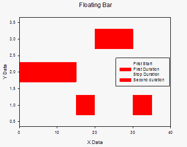
In this horizontal bar graph, "colors from columns" are used to display alternating states of one variable in stacked bars
|
Should you wish no further mailing from us, please forward this mail to kontakt@systat.de with the subject
"Unsubscribe [Email]".
| Systat Software GmbH - Tel.: 0 2104 9540 - Email: kontakt@systat.de |